By Lance Whitney
File Explorer in Windows 11 works mostly the same as in Windows 10, but there are visual and layout tweaks as well as new menus and locations for key commands.
Those of you who upgrade to Windows 11 have to contend with a new and decidedly unimproved Start menu, a more limited Taskbar, and other changes that may leave you cold. Fortunately, File Explorer is one feature that survived the move to Windows 11 without major damage.
Instead of crippling the functionality of File Explorer, Microsoft actually enhanced it in certain ways. The feature has a new look and layout that give it some pizzazz. The ribbon has been jettisoned. Several key menus and commands have been relocated or condensed. I’d say the changes help for the most part, though some people will likely be thrown by them — at least at first.
So how does the Windows 11 File Explorer compare with its Windows 10 counterpart?
The first time you open File Explorer in Windows 11, you’ll notice the visual changes. The square corners have been replaced by rounded corners as part of the new Windows 11 aesthetic. Depending on your Windows color scheme, the overall tone is softer.
The most obvious difference lies with the folder icons. Instead of the generic yellow icons, the built-in default folders sport different colors with embedded images representing the various functions. So the Downloads folder is green with a down arrow on it. The Music folder is reddish-brown with a musical note on it. And the Videos folder is purple with a play button on it. In addition to being more colorful and compact, the new icons look sleeker (Figure 1).
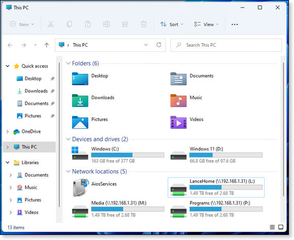
Figure 1. The core folders in Windows 11 get a paint job with different colors and embedded images.
Drill down to the subfolders, and those still use the same generic folder icons. But as in Windows 10, you can tweak the look and imagery of any folder icon through the Customize area of the Properties window.
Look around further. Another significant change is the new and more compact command bar, which replaces the bigger and bulkier ribbon in Windows 10. On the plus side, the smaller command bar leaves more room to view your folders and files. But there are a few downsides.
One drawback is that most of the icons have no labels. If you don’t know the function of a particular icon, you’ll have to hover over it for a second to see its name. Experienced Windows users will be able to identify Cut, Copy, Paste, and other commands right off the bat. Newbies will have to get used to the nameless icons. The other core commands include Rename, Share, and Delete. After you select a subfolder or file, most of the commands become available, allowing you to cut or copy and then paste an item, rename it, share it, or delete it. (See Figure 2.)
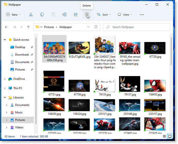
Figure 2. Select a subfolder or file, and the command bar activates commands for cut, copy, paste, rename, share, and delete.
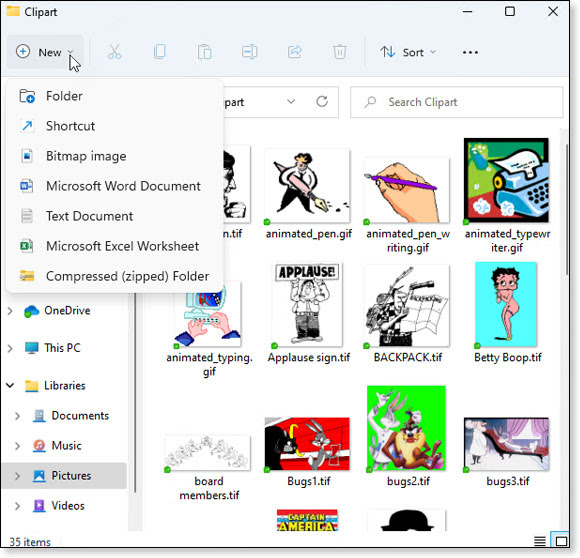
Select or open just about any folder, and the New menu becomes available. Click on New to create a new folder, shortcut, bitmap image, text file, or compressed folder. Certain applications, such as Microsoft Office, populate the New menu with their own commands (see Figure 3). As in Windows 10, there’s no easy way to edit the New menu without diving into the Registry or using a third-party utility.
Figure
3. The New menu lets you create a new folder, shortcut, and certain
other items, but there’s no easy way to edit the list.
From the command bar, click the Sort icon to sort your folders and files by name, date, size, and type as well as group them by different criteria. Click the View menu (Figure 4) to change the view among different size icons, lists, detailed view, and tiles. A compact view mode shrinks the space between listed items. From the View menu, you can opt to see the details pane, preview pane, check boxes, filename extensions, and hidden items.
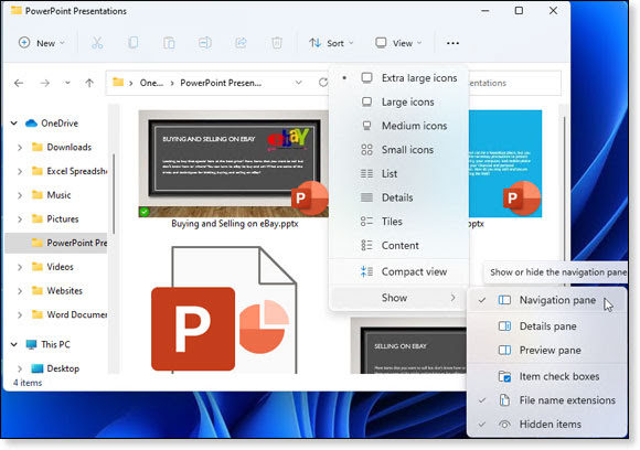
Figure 4. Select the View menu to change the view of your folders and files and turn on different panes and other items.
The “See more” icon (three dots) paves the way to even more commands, some of which always appear and others that are context-sensitive. Such commands as Select all and Select none show up all the time. But others pop up, depending on your current location or selection.
For example, select the entry for This PC, and this menu displays commands to add a network location, map a network drive, and disconnect a network drive. Select a folder or file, and the menu adds a command for Pin to Quick Access to add that item to the Quick Access section. Select one or more files, and you’ll see a command to compress them to a ZIP archive. Select a specific type of file, such as an image, and you get commands to set that image as your background, rotate it left, and rotate it right (see Figure 5).
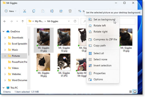
Figure
5. The "See more" menu item (three dots) is context-sensitive with
commands that change depending on your current folder or file.
From the same menu, selecting the Properties command shows you the location, size, attributes, security details, and folder-customization settings. And selecting the Options command takes you to the Folder Options screen to tweak the behaviors, layouts, and other settings for your folders.
Most of the commands accessible from the command bar should be familiar to long-time Windows users. What’s different is where and how you access these options. In the Windows 10 File Explorer, you select different ribbons to get to specific commands. For example, the Home ribbon provides commands for Cut, Copy, Paste, Delete, Rename, etc. The Share ribbon offers commands to share a folder or files, email a file, burn a file to disc, and print a file. And the View ribbon lets you change the views of your folders and files.
By dispensing with all the ribbons, the Windows 11 File Explorer shoves everything into one single toolbar, a change that’s both good and bad. I like the condensed layout of the command bar and won’t really miss the ribbons. But finding certain commands is now more challenging as you have to hunt for them throughout the new menus — especially the ones that are context sensitive.
Another significant change in the Windows 11 File Explorer is the context menu, aka the right-click menu. In Windows 10, one drawback of the right-click menu is that it can easily turn into a long and cluttered mess, especially as you install more applications (see Figure 6).
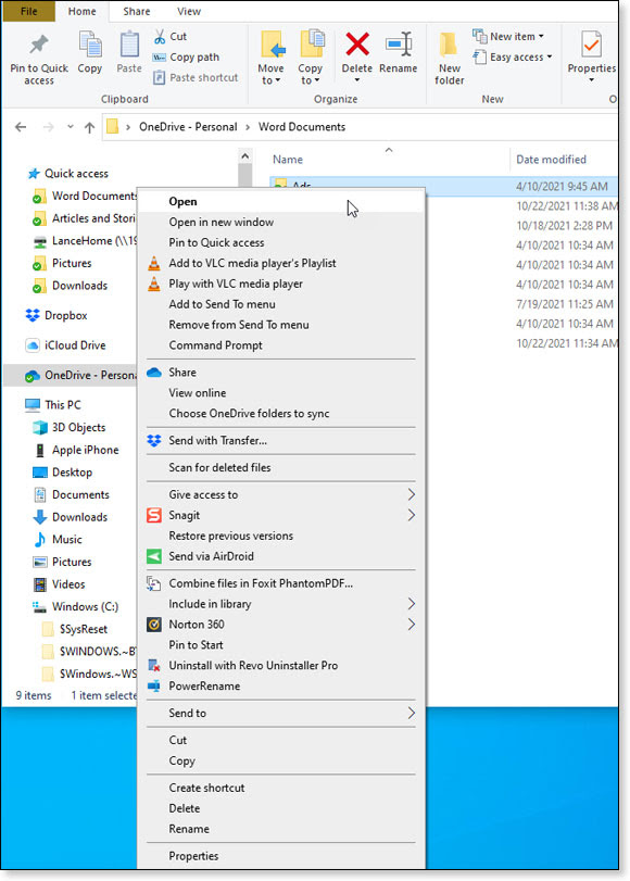
Figure 6. The right-click menu in Windows 10 File Explorer easily turns into a lengthy mess of commands.
To cut down on the potential clutter in Windows 11, Microsoft reduced the menu to display only the basic commands. Mimicking the command bar, the right-click menu displays icons for Cut, Copy, Rename, Share, and Delete. The other commands are context-sensitive, depending on what type of folder or file you select. To access all the available commands, click the one for Show more options, and you’ll see the more familiar and likely more crowded menu (see Figure 7).
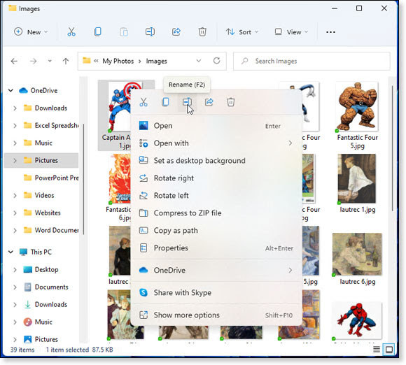
Figure 7. The right-click menu in Windows 11 File Explorer is much more compact, and you can still access the full menu.
Because the right-click menu can so easily get out of hand in Windows 10, Microsoft needed to do something to clean it up. The change in Windows 11 works for me, especially because the full menu is still accessible. But that doesn’t mean it will work for everyone, particularly if your favorite commands aren’t visible right off the bat. For those of you who prefer the Windows 10 menu, there are a couple of ways to get it back — one via Windows Terminal and another via the Registry. Just do a Web search for “windows 11 right click menu," and you’ll find several results to guide you through the process for reverting to the old-style menu.
I'll be very interested to hear your opinion about the context menu changes in the Forums.
Finally, one flaw with the Windows 11 File Explorer is the same split personality that affects the entire operating system. Most windows and menus display the new aesthetic with a different font and rounded corners, while others are stuck in the Dark Ages with the old look. A good example is the right-click menu. Right-click on an item, and the menu uses the Windows 11 aesthetic. Click the command for Show more options, and that menu still uses the older legacy style. Though this is a stylistic issue that shouldn’t impact how you use File Explorer, it smacks of a certain sloppiness. And it serves as yet another clue that Microsoft rushed Windows 11 out the door before it was ready.
Overall, the new File Explorer
is a bit of a mixed bag, especially for Windows 10 users who upgrade.
The aesthetic changes are fine, though I don’t think they’ll affect your
work or productivity one way or the other. The new menus and the more
condensed locations save on space, but people accustomed to the Windows
10 interface will likely need time to adapt. I give Microsoft an A for
effort and a B for execution. At the very least, let’s be thankful
Microsoft didn’t screw up File Explorer in Windows 11, as it did the
Start menu and Taskbar.
Lance Whitney is a freelance technology reporter and former IT
professional. He's written for CNET, TechRepublic, PC Magazine, and
other publications. He's authored a book on Windows and another about
LinkedIn.
Source: https://www.askwoody.com/newsletter/free-edition-how-windows-11-changes-file-explorer-for-better-or-for-worse/